Fibonacci Oscillator (Expo)█ Overview
The Fibonacci Oscillator is a multi-faceted oscillator designed to provide traders with a comprehensive understanding of market trends and retracement points. Built on the Fibonacci ratios, it combines the functionalities of popular oscillators like RSI and MACD with unique insights into the market structure. This oscillator not only helps identify trend direction but also pinpoints overbought and oversold levels, making it an essential tool for various trading strategies.
█ How to Use
Identify Trends
Use the oscillator to identify the direction of the market trend.
Identify Retracements
Use the oscillator to identify the retracements.
█ Settings
Fibonacci Settings
These settings let you customize the Fibonacci level to focus on, thereby allowing you to tailor the oscillator according to your trading preferences.
Oscillator Settings
You can also choose between different oscillator types (RSI, MACD, Histogram) and adjust their respective settings like lengths, signals, and colors.
-----------------
Disclaimer
The information contained in my Scripts/Indicators/Ideas/Algos/Systems does not constitute financial advice or a solicitation to buy or sell any securities of any type. I will not accept liability for any loss or damage, including without limitation any loss of profit, which may arise directly or indirectly from the use of or reliance on such information.
All investments involve risk, and the past performance of a security, industry, sector, market, financial product, trading strategy, backtest, or individual's trading does not guarantee future results or returns. Investors are fully responsible for any investment decisions they make. Such decisions should be based solely on an evaluation of their financial circumstances, investment objectives, risk tolerance, and liquidity needs.
My Scripts/Indicators/Ideas/Algos/Systems are only for educational purposes!
Cari dalam skrip untuk "market structure"

Liquidity Candles with Prev Day High/Low and Midnight OpenAlright, let's talk about how to use this fancy indicator. But first, let me warn you, using indicators is like driving a car, you can't just press the gas pedal and hope for the best. You need to know what you're doing, or else you'll crash and burn faster than a soufflé in a microwave.
Now, let's get started. The first thing you need to do is understand what this indicator is telling you. Think of it like a signalman at a train station. He's waving flags and giving hand signals to tell you whether it's safe to proceed or if you need to stop and wait. This indicator works the same way.
It's going to give you signals based on price movements, telling you whether it's safe to buy or sell. But don't get too excited, my friend. You still need to use your brain and make smart decisions. Don't just blindly follow the signals, or else you'll end up like a sheep being led to the slaughter.
Now, let's talk about some of ICT's smart money trading concepts. First up, we have "liquidity grabs". This is when the big boys in the market create false breakouts to shake out the weak hands. They're like school bullies stealing lunch money from the little kids. But you can avoid being a victim by watching for signs of a liquidity grab, and using your brain to decide whether it's a real breakout or just a trap.
Next up, we have "stop runs". This is when the big players purposely trigger stop-loss orders to get a better entry or exit. It's like a game of chicken, but with your money on the line. To avoid being run over, keep an eye on your stop-loss orders, and don't be too predictable in your trading.
Finally, we have "market structure". This is like the blueprint of the market, showing you where the support and resistance levels are. It's like a treasure map to finding the best trades. But don't forget that market structure can change over time, so keep updating your map and stay ahead of the game.
So there you have it, my friend. A quick tutorial on using this indicator, with a side of ICT's smart money trading concepts. But remember, indicators are just tools, and you're the one driving the car. Use your brain, stay alert, and don't be a sheep. Happy trading!
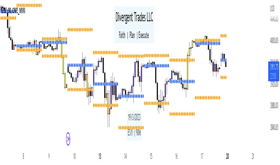
Divergent Trades LLC:
Disclaimer: The information provided by the Divergent Trades LLC indicator is for educational and informational purposes only. It should not be considered financial advice or a recommendation to buy, sell, or trade any financial instrument. Divergent Trades LLC is not responsible for any losses incurred as a result of using this indicator. Trading in the financial markets carries a high level of risk and may not be suitable for all investors. Before making any investment decisions, please consult with a financial advisor and do your own due diligence. Past performance is not indicative of future results. By using the Divergent Trades LLC indicator, you acknowledge that you have read and understand this disclaimer and agree to its terms and conditions.
3 Candle Strike StretegyMainly developed for AMEX:SPY trading on 1 min chart. But feel free to try on other tickers.
Basic idea of this strategy is to look for 3 candle reversal pattern within trending market structure. The 3 candle reversal pattern consist of 3 consecutive bullish or bearish candles,
followed by an engulfing candle in the opposite direction. This pattern usually signals a reversal of short term trend. This strategy also uses multiple moving averages to filter long or short
entries. ie. if the 21 smoothed moving average is above the 50, only look for long (bullish) entries, and vise versa. There is option change these moving average periods to suit your needs.
I also choose to use Linear Regression to determine whether the market is ranging or trending. It seems the 3 candle pattern is more successful under trending market. Hence I use it as a filter.
There is also an option to combine this strategy with moving average crossovers. The idea is to look for 3 candle pattern right after a fast moving average crosses over a slow moving average.
By default , 21 and 50 smoothed moving averages are used. This gives additional entry opportunities and also provides better results.
This strategy aims for 1:3 risk to reward ratio. Stop losses are calculated using the closest low or high values for long or short entries, respectively, with an offset using a percentage of
the daily ATR value. This allows some price fluctuation without being stopped out prematurely. Price target is calculated by multiplying the difference between the entry price and the stop loss
by a factor of 3. When price target is reach, this strategy will set stop loss at the price target and wait for exit condition to maximize potential profit.
This strategy will exit an order if an opposing 3 candle pattern is detected, this could happen before stop loss or price target is reached, and may also happen after price target is reached.
*Note that this strategy is designed for same day SPY option scalping. I haven't determined an easy way to calculate the # of contracts to represent the equivalent option values. Plus the option
prices varies greatly depending on which strike and expiry that may suits your trading style. Therefore, please be mindful of the net profit shown. By default, each entry is approximately equal
to buying 10 of same day or 1 day expiry call or puts at strike $1 - $2 OTM. This strategy will close all open trades at 3:45pm EST on Mon, Wed, and Fri.
**Note that this strategy also takes into account of extended market data.
***Note pyramiding is set to 2 by default, so it allows for multiple entries on the way towards price target.
Remember that market conditions are always changing. This strategy was only able to be back-tested using 1 month of data. This strategy may not work the next month. Please keep that in mind.
Also, I take no credit for any of the indicators used as part of this strategy.
Enjoy~

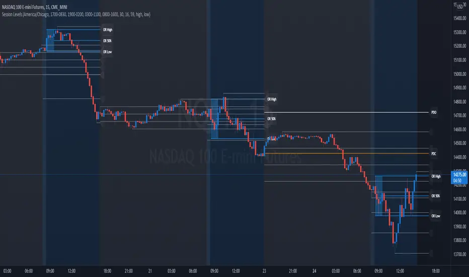
Session Levels - Ultimate Range IndicatorSession Levels - Ultimate Range Indicator
Primarily developed for trading the E-MINI Futures Markets like NQ or ES from the CME Group,
but also more than suitable for Crypto or other instruments.
This indicator highlights the chosen session, which can be Globex, Asian, London and New York.
It plots the important levels and also renders the Opening Range as it forms (a.k.a. Initial Balance).
After the 1st hour Opening Range is finished, it can plot the Standard Deviations / Projections.
See below for a complete feature list.
All Opening Ranges on chart and for the New York session the Range Projections are turned on:
s3.tradingview.com
How to use (example):
If you are trading the Nasdaq Futures (NQ!)
Enable the Globex Overnight session. Basically in the Futures Market, the Globex session is everything outside of US trading hours of Stocks. This draws the important overnight levels, like the Low, 25%, 50%, 75% and the High.
Enable the New York Session with Levels and Opening Range. Generally, 70% of the time the 1st hour will put a Low or High of the day.
If the price is trading above the Globex Low, most likely the Low of the Day is formed and the price target for the day will be 1.5x Standard Deviation and 2x Standard Deviation.
[*} Deviation of the Initial Balance depends on the volume ad overall market structure.
** This is not financial advice or any guarantee **
Features:
Show each Session Highlighted on Intraday chart in it's own color (each session can be turned off and has customizable times and color)
Show Line Levels of each session: Low, 25%, 50%, 75% and the High (customizable color)
Show the Opening Range (Initial Balance) of the Asian, London and New York session. Note: NY has more options.
Opening Range is displayed as a box with level lines (customizable color)
Levels are drawn to the end of the NY Cash session (customizable time)
Show IB Standard Deviations 0.5 - 3.0. Calculated from the Opening Range (Initial Balance)
Option to display Higher Timeframe levels: Previous Day Open/Close and Previous Week Open/Close
All level lines and OR boxes size dynamically as the session progresses
Built in Alerts for when price hits key levels. e.g. Alert when price crosses the NY Opening Range High. Or an Alert when the first STDEV is hit.
Option to toggle display of drawings for Today's trading session only, or Show all recent session levels. This keeps the chart clean or not.
Extras:
The NY Opening Range also has a 50% level line
The NY Opening Bar can be highlighted separately
The Level Lines can have small labels turned on/off. Values are only shown on mouse over to keep a clean chart
Keep in mind:
1) This indicator works on all instruments, but on instruments with limited market hours, your chart setting
has to be set to "Extended Hours" otherwise. For example TSLA on NASDAQ.
2) The Exchange Time Zone for the CME Group is Chicago UTC-6. So the session times you configure in the settings menu are based on that timezone too.
3) Globex opens at 5pm CST and closes when the US session starts 8:30CST.
4) When enabling the Alerts in the Indicator settings, be sure to also create an alarm for this indicator using the Alarm function of Tradingview.
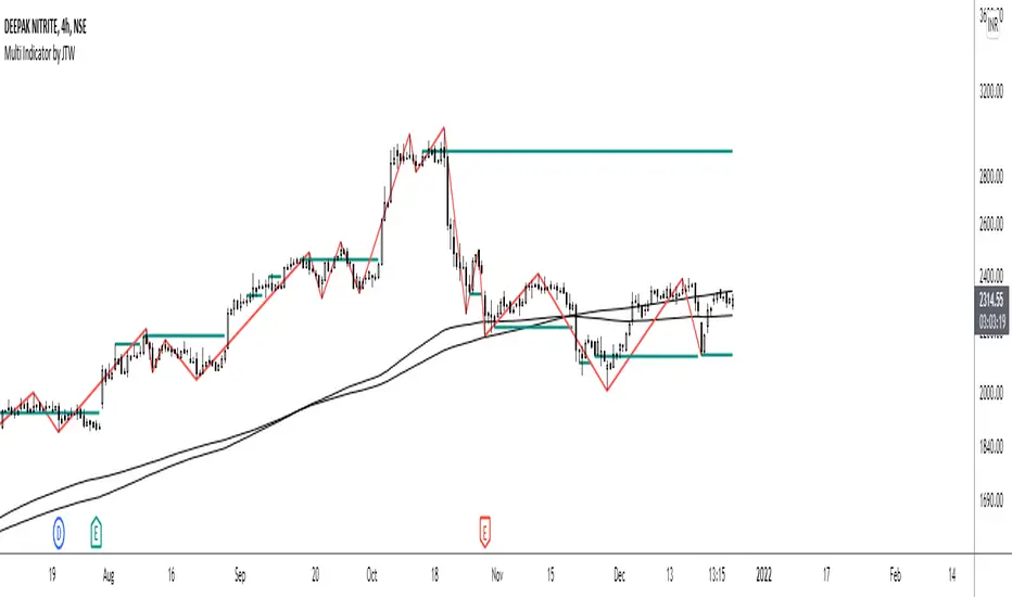
Multi-Indicator by johntradingwickThe Multi-Indicator includes the functionality of the following indicators:
1. Market Structure
2. Support and Resistance
3. VWAP
4. Simple Moving Average
5. Exponential Moving Average
Functionality of the Multi-Indicator:
Market Structure
As we already know, the market structure is one of the most important things in trading. If we are able to identify the trend correctly, it takes away a huge burden. For this, I have used the Zig Zag indicator to identify price trends. It plots points on the chart whenever the prices reverse by a larger percentage than a predetermined variable. The points are then connected by straight lines that will help you to identify the swing high and low.
This will help you to filter out any small price movements, making it easier to identify the trend, its direction, and its strength levels. You can change the period in consideration and the deviation by changing the deviation % and the depth.
Support and Resistance
The indicator provides the functionality to add support and resistance levels. If you want more levels just change the timeframe it looks at in the settings. It will pull the SR levels off the timeframe specified in the settings.
You can select the timeframe for support and resistance levels. The default time frame is “same as the chart”.
You can also extend lines to the right and change the width and colour of the lines. There is also an option to change the criteria to select the lines as valid support or resistance. You can extend the S/R level or use the horizontal lines to mark the level when there is a change in polarity.
VWAP
Volume Weighted Average Price (VWAP) is used to measure the average price weighted by volume. VWAP is typically used with intraday charts as a way to determine the general direction of intraday prices. It's similar to a moving average in that when the price is above VWAP, prices are rising and when the price is below VWAP, prices are falling. VWAP is primarily used by technical analysts to identify market trend.
Simple Moving Average
A simple Moving Average is an unweighted Moving Average. This means that each day in the data set has equal importance and is weighted equally. As each new day ends, the oldest data point is dropped and the newest one is added to the beginning.
The multi-indicator has the ability to provide 5 moving averages. This is particularly helpful if you want to use various time periods such as 20, 50, 100, and 200. Although this is just basic functionality, it comes in handy if you are using a free account.
Exponential Moving Average
An exponential moving average (EMA) is a type of moving average (MA) that places a greater weight and significance on the most recent data points. An exponentially weighted moving average reacts more significantly to recent price changes than a simple moving average. The multi-indicator provides 5 exponential moving averages. This is particularly helpful if you want to use various time periods such as 20, 50, 100, and 200.
Higher Order PivotsFirst order pivot points are defined as 3 or 5 bar "V" shaped patterns. For example a high with a lower high either side of the peak and in the case of the 5 bar variant with lower highs adjacent to a high below the peak.
Second order pivot points are defined by three first order pivots in the same manner. For example a peak pivot high with a lower pivot high to either side.
Third order pivots follow the same pattern, a peak second order pivot high with two adjacent second order pivot highs.
As it can take a significant and variable amount of time before higher order pivots are confirmed, it is generally inadvisable to use higher order pivots for live trading!
However they can be used for historical analysis. For example to delineate market structure of major market inflections.
For example :
Delineating market structure using 2nd order pivots derived from 3 bar, 1st order pivots
Major market inflections from 3rd order pivots derived from 5 bar, 1st order pivots

TM_INTRADAY_TOOLTM_INTRADAY_TOOL helps to identify following Things for Intraday Position on 1-3-5-10-15-30-60 Minutes and Daily timeframe along with Buy or sell signal.
1. Market Trend (Different Timeframe)
2. Price Direction
3. Area of Support & Resistance
4. Price Momentum
5. Volume Based Breakouts
Terminology Use ==> Black from Bottom for - Buy, Red from Top for - Sale Signal, and Numbers are to show time frame indication there is presence of buyer or seller like 1 for buy signal on 1 minute time frame etc.
Display and Interpretation ==> Buy Sale Signal in Digit with 1-3-5-10-15-30-60-D for different time frames.
any value signal ending with * shows breakout of support/ resistance and value signal starting with * shows entry to a momentum zone.
Green Mark with Triangle Up shows trend of that timeframe in positive and value shows upside possible direction on that timeframe vice versa for red signal with down triangle
T1 stand for trend change in 1 Minute timeframe and T3 stand for trend change in 3 Minute timeframe
Use market structure, chart pattern, trend lines for more support..
Time frame ==> Use proper Signal with 1 minute, 3 minute time frame
What to Identify ==> Overall Trend for the intraday
How to Use ==>
See how and order buildup is seen and current order position. Also area for volatility and expected movement in price direction
Note: - Use market structure, chart pattern, trend lines and price action parameter for more confirmation.
Entry ==>
Let’s wait the proper area of support or resistance ( Area of Value in case of trend pattern use)
Exit ==>
SL of swing high/low out of market structure with proper risk management and target with proper Risk/ Reward Ratio
Use the Below Contacts to Access this Indicator
Jurik Angle Flow [Kodexius]Jurik Angle Flow is a Jurik based momentum and trend strength oscillator that converts Jurik Moving Average behavior into an intuitive angle based flow gauge. Instead of showing a simple moving average line, this tool measures the angular slope of a smoothed Jurik curve, normalizes it and presents it as a bounded oscillator between plus ninety and minus ninety degrees.
The script uses two Jurik engines with different responsiveness, then blends their information into a single power score that drives both the oscillator display and the on chart gauge. This makes it suitable for identifying trend direction, trend strength, exhaustion conditions and early shifts in market structure. Built in divergence detection between price and the Jurik angle slope helps highlight potential reversal zones while bar coloring and a configurable no trade zone assist with visual filtering of choppy conditions.
🔹 Features
🔸 Dual Jurik slope engine
The indicator internally runs two Jurik Moving Average calculations on the selected source price. A slower Jurik stream models the primary trend while a faster Jurik stream reacts more quickly to recent changes. Their slopes are measured as angles in degrees, scaled by Average True Range so that the slope is comparable across different instruments and timeframes.
🔸 Angle based oscillator output
Both Jurik streams are converted into angle values by comparing the current value to a lookback value and normalizing by ATR. The result is passed through the arctangent function and expressed in degrees. This creates a smooth oscillator that directly represents steepness and direction of the Jurik curve instead of raw price distance.
🔸 Normalized power score
The angle values are transformed into a normalized score between zero and one hundred based on their absolute magnitude, then the sign of the angle is reapplied. This yields a symmetric score where extreme positive values represent strong bullish pressure and extreme negative values represent strong bearish pressure. The final power score is a weighted blend of the slow and fast Jurik scores.
🔸 Adaptive color gradients
The main oscillator area and the fast slope line use gradient colors that react to the angle strength and direction. Rising green tones reflect bullish angular momentum while red tones reflect bearish pressure. Neutral or shallow slopes remain visually softer to indicate indecision or consolidation.
🔸 Trend flip markers
Whenever the primary Jurik slope crosses through zero from negative to positive, an up marker is printed at the bottom of the oscillator panel. Whenever it crosses from positive to negative, a down marker is drawn at the top. These flips act as clean visual signals of potential trend initiation or termination.
🔸 Divergence detection on Jurik slope
The script optionally scans the fast Jurik slope for pivot highs and lows. It then compares those oscillator pivots against corresponding price pivots.
Regular bullish divergence is detected when the oscillator prints a higher low while price prints a lower low.
Regular bearish divergence is detected when the oscillator prints a lower high while price prints a higher high.
When detected, the tool draws matching divergence lines both on the oscillator and on the chart itself, making divergence zones easy to notice at a glance.
🔸 Bar coloring and no trade filter
Bars can be colored according to the primary Jurik slope gradient so that price bars reflect the same directional information as the oscillator. Additionally a configurable no trade threshold can visually mute bars when the absolute angle is small. This highlights trending sequences and visually suppresses noisy sideways stretches.
🔸 On chart power gauge
A creative on chart gauge displays the composite power score beside the current price action. It shows a vertical range from plus ninety to minus ninety with a filled block that grows proportionally to the normalized score. Color and label updates occur in real time and provide a quick visual summary of current Jurik flow strength without needing to read exact oscillator levels.
🔹 Calculations
Below are the main calculation blocks that drive the core logic of Jurik Angle Flow.
Jurik core update
method update(JMA self, float _src) =>
self.src := _src
float phaseRatio = self.phase < -100 ? 0.5 : self.phase > 100 ? 2.5 : self.phase / 100.0 + 1.5
float beta = 0.45 * (self.length - 1) / (0.45 * (self.length - 1) + 2)
float alpha = math.pow(beta, self.power)
if na(self.e0)
self.e0 := _src
self.e1 := 0.0
self.e2 := 0.0
self.jma := 0.0
self.e0 := (1 - alpha) * _src + alpha * self.e0
self.e1 := (_src - self.e0) * (1 - beta) + beta * self.e1
float prevJma = self.jma
self.e2 := (self.e0 + phaseRatio * self.e1 - prevJma) * math.pow(1 - alpha, 2) + math.pow(alpha, 2) * self.e2
self.jma := self.e2 + prevJma
self.jma
This method implements the Jurik Moving Average engine with internal state and phase control, producing a smooth adaptive value stored in self.jma.
Angle calculation in degrees
method getAngle(float src, int lookback=1) =>
float rad2degree = 180 / math.pi
float slope = (src - src ) / ta.atr(14)
float ang = rad2degree * math.atan(slope)
ang
The slope between the current value and a lookback value is divided by ATR, then converted from radians to degrees through the arctangent. This creates a volatility normalized angle oscillator.
Normalized score from angle
method normScore(float ang) =>
float s = math.abs(ang)
float p = s / 60.0 * 100.0
if p > 100
p := 100
p
The absolute angle is scaled so that sixty degrees corresponds to a score of one hundred. Values above that are capped, which keeps the final score within a fixed range. The sign is later reapplied to restore direction.
Slow and fast Jurik streams and power score
var JMA jmaSlow = JMA.new(jmaLen, jmaPhase, jmaPower, na, na, na, na, na)
var JMA jmaFast = JMA.new(jmaLen, jmaPhase, 2.0, na, na, na, na, na)
float jmaValue = jmaSlow.update(src)
float jmaFastValue = jmaFast.update(src)
float jmaSlope = jmaValue.getAngle()
float jmaFastSlope = jmaFastValue.getAngle()
float scoreJma = normScore(jmaSlope) * math.sign(jmaSlope)
float scoreJmaFast = normScore(jmaFastSlope) * math.sign(jmaFastSlope)
float totalScore = (scoreJma * 0.6 + scoreJmaFast * 0.4)
A slower Jurik and a faster Jurik are updated on each bar, each converted to an angle and then to a signed normalized score. The final composite power score is a weighted blend of the slow and fast scores, where the slow score has slightly more influence. This composite drives the on chart gauge and summarizes the overall Jurik flow.

Pivot Oscillator█ OVERVIEW
Pivot Oscillator is a versatile oscillator that measures market strength by comparing the current price to local price pivots. Values are scaled by ATR, normalized to a 0–100 range, and displayed along with an SMA line.
Oscillator: generates signals suitable for pullback strategies.
SMA line: serves as a momentum indicator.
█ CONCEPTS
Pivot Oscillator is designed with dual functionality:
- Oscillator & signals: ideal for pullback strategies, detecting local highs/lows and short-term reversals.
- SMA (Momentum): shows stable market-side dominance and filters price impulses.
Calculation logic:
- Oscillator = closing price − pivot line (derived from average high/low pivots).
Scaled by ATR and normalized to 0–100:
50 – bullish dominance,
< 50 – bearish dominance.
SMA is computed from smoothed oscillator values and serves as a momentum indicator.
█ FEATURES
Pivot Calculation:
- Pivot Length (lenSwing) – the number of bars used to identify local pivots (highs/lows). Higher values filter only larger extremes, while lower values make the oscillator react faster to local highs and lows.
- Pivot Level (pivotLevel) – determines the position of the pivot line between the average low and high pivots. A value of 0.5 places the pivotLine exactly halfway between the average high and low pivots; values closer to 0 or 1 shift the line toward the low or high pivots, respectively.
- Pivot Lookback (lookback) – the number of recent pivots used to calculate the average pivot, which smooths the pivotLine and reduces noise caused by individual extremes.
- Oscillator calculation: closing price − pivotLine (average of pivots computed from the above parameters).
The pivotLine is then scaled by ATR and normalized to a 0–100 range.
ATR Scaling:
- ATR period (atrLen)
- Multipliers (multUp / multDown) for upper and lower scaling.
Dynamic Colors:
- Oscillator > 50 → green (bullish)
- Oscillator < 50 → red (bearish)
SMA Line (Momentum):
- Smoothed oscillator (SMA) serves as a momentum indicator.
- Dynamic color indicates direction of SMA.
- Helps identify dominant market side and trend.
Overbought / Oversold Zones:
- Configurable OB/OS levels for both oscillator and SMA.
- Dynamic band colors: change depending on SMA relative to maOverbought / maOversold.
- Provides visual confirmation for potential corrections or strong momentum.
Gradients & Visualization:
- Oscillator and SMA gradients (3 layers) with adjustable transparency.
- Gradient visualization for OB/OS zones and oscillator.
- Full customization of colors, line width, and transparency.
Signals:
- Oscillator leaving oversold zone → long signal
- Oscillator leaving overbought zone → short signal
- OB/OS band colors dynamically reflect SMA levels for additional confirmation.
Alerts:
- OB/OS cross alerts.
█ HOW TO USE
Add the indicator to your TradingView chart → Indicators → search for “Pivot Oscillator”.
Parameter Configuration:
- Pivot Settings: pivot length, pivot level, pivot lookback.
- ATR Settings: ATR period, scaling multipliers.
- Threshold Levels: OB/OS levels for oscillator and SMA.
- Signal Settings: SMA length, extra smoothing.
- Style Settings: bullish/bearish colors, OB/OS lines, midline, text colors.
- Gradient Settings: enable/disable gradients and transparency.
Signal Interpretation:
BUY (Long):
- Oscillator leaves the oversold zone (OS crossover).
- OB/OS band color may additionally confirm the signal when SMA < maOversold.
SELL (Short):
- Oscillator leaves the overbought zone (OB crossunder).
- OB/OS band color may additionally confirm the signal when SMA > maOverbought.
█ APPLICATIONS
Pivot Oscillator and SMA can be scaled for different strategies:
- Pullback strategies: oscillator detects local highs/lows.
- Momentum / Trend: SMA shows market-side dominance and trend direction.
Adjust pivot and ATR parameters:
- Lower settings: faster reaction, suitable for scalping or intraday trading.
- Higher settings: more stable readings, suitable for swing trading or longer timeframes.
█ NOTES
- In strong trends, the oscillator may remain in extreme zones for extended periods – reflects dominance, not necessarily a reversal.
- OB/OS levels should be adapted to the instrument and pivot/ATR settings.
- Works best when combined with other tools: support/resistance, market structure, and volume analysis.

ForzAguanno - Premium / Discount (Range Glissant)Premium / Discount Zones – Dynamic Range (Fibo-based)
This indicator highlights Premium, Discount, and Equilibrium zones using a dynamic Fibonacci range calculated from recent price action.
It is designed to help traders contextualize price and avoid taking trades in unfavorable locations (e.g. buying too high or selling too low).
- How it works
The indicator automatically:
- Detects the highest high (HH) and lowest low (LL) over a rolling range
- Builds a Fibonacci-style structure between LL → HH
- Defines three key areas:
Discount Zone (lower part of the range)
Equilibrium Zone (around the 50% level)
Premium Zone (upper part of the range)
Two additional extreme levels are used:
0.075 → deep discount
0.925 → deep premium
These levels help isolate areas where price is statistically stretched.
- Visual elements
- Horizontal levels:
- Green → Discount
- Purple → Equilibrium
- Red → Premium
- Text labels are placed inside each zone for instant readability.
Zones are extended into the future for cleaner visualization.
- How to use it
This tool is best used as a context filter, not a standalone signal generator.
Typical use cases:
Look for longs in Discount
Look for shorts in Premium
Use Equilibrium as a neutral / decision zone
Combine with structure, momentum, or entry models
It works particularly well with:
Market structure concepts
Smart money / range-based trading
Session-based strategies
⚠️ Important notes
This indicator does not predict direction
It provides context, not signals
Always combine with proper risk management
Final thoughts
The goal of this indicator is simplicity and clarity:
Know where price is located inside its range before taking a trade.
If you find it useful, feel free to share feedback.

Kernel EnvelopeKernel Envelope is a non-repainting dynamic band system designed to identify price overextension, trend exhaustion, volatility expansion, and high-probability reversal points.
Using a kernel-based smoothing technique, the indicator builds adaptive upper and lower envelopes that respond fluidly to market structure while maintaining exceptional stability for systematic trading.
These envelopes form the core of the system and allow traders to:
Detect bullish rebounds from the lower band
Detect bearish rejections from the upper band
Filter trend-following entries using volatility context
Identify zones where price is statistically stretched
Highlight exhaustion points during impulsive moves
The indicator also includes an integrated pivot-based trendline engine, which draws dynamic support and resistance levels derived from structural highs and lows.
These lines auto-extend forward and include breakout alerts, making them ideal for breakout traders, liquidity hunters, and structure-based strategies.
Key Features
Fully non-repainting envelope calculation
Adaptive smoothing responsive to market volatility
Clean gold/silver visual theme for maximum clarity
Glow-style rendering for enhanced band visibility
Automatic trendline generation using pivot points
Breakout alerts for upper and lower trendlines
Rebound and rejection alerts on envelope interaction
Works on all markets and timeframes
Whether you trade reversals, breakouts, or trend continuation setups, Kernel Envelope provides a reliable, low-noise framework for identifying high-quality trade signals.
Acknowledgment
This indicator is inspired by the original Nadaraya-Watson Envelope by LuxAlgo, whose work served as the foundation for further research and development.
Follow Me on X
For more indicators, updates, automated strategies, and educational content, you can follow me here:
X (Twitter): x.com

Tomb Reversal Signal Engulfing + RSI Momentum DetectorTomb is a fast and minimalistic reversal-detection indicator built to capture high-probability turning points in the market.
It combines engulfing candlestick patterns, a strong candle body filter, and RSI momentum analysis to generate precise BUY and SELL signals with minimal noise.
🔍 How it Works
The indicator triggers:
✅ BUY Signal
Bullish engulfing pattern appears
Candle body strength > 50% of total range (real momentum)
RSI below 50 (bearish momentum weakening)
Price decreasing over the last 5 bars (down-trend exhaustion)
✅ SELL Signal
Bearish engulfing pattern
Candle body shows strength
RSI above 50 (bullish momentum weakening)
Price increasing over the last 5 bars (up-trend exhaustion)
⚡ Why Tomb Works
Filters out weak signals using candle structure
Detects momentum shifts early
Works on all markets: Crypto, Forex, Indices, Stocks
Ideal for scalping, day trading, or swing trading
🎯 Purpose
To highlight the exact moments where the market shows exhaustion and is ready to reverse—before most traders see it.
📌 Recommended Use
For best performance:
Combine with trend tools such as EMA 200 or market structure
Look for signals at support/resistance or liquidity zones

Market Profile with TPO - chorseThis Pine Script indicator draws a Market Profile (also known as a Time Price Opportunity, or TPO, chart) directly onto your candlestick chart. It is an advanced analytical tool used primarily by futures and commodities traders to understand market structure and who is in control (buyers or sellers) at various price levels.
The Market Profile is built over a specific trading session (which you can customize) and visually organizes price data to show where the market spent the most time at a particular price.
TPO (Time Price Opportunity)
The basic building block. Each letter (A, B, C, etc.) represents a specific, equal block of time (e.g., 30 minutes) during the session. The profile is formed by stacking these letters horizontally across the price axis, showing all the price levels traded during that time block. The script plots TPO letters (TPO_Names array) at the bar index corresponding to when that price was traded. This creates the typical profile shape.
Point of Control (POC)
The single price level that has the most TPOs (the longest horizontal row of letters). It represents the level where the market spent the most time and is considered the fairest price or gravitational center for the session.
Calculated by finding the price level (TPO_POC) with the maximum number of TPOs (max_TPOs). The script includes logic to break ties by choosing the POC closest to the session's midpoint (TPO_mid). This level is highlighted with a box and a line.
Value Area (VA)
The price range that contains a configurable percentage of the total TPOs (typically 68.26% or 70%). This zone is considered the "fair value" range where the majority of the session's activity occurred. Calculated as the range between the Value Area High (VAH) and Value Area Low (VAL). The script uses an iterative function (fn_build_VA) to expand out from the POC until the defined percentage (value_area_pct) of TPOs is included. These boundaries are highlighted with lines.

HTF Candle Overlay – Multi-Timeframe Visualization ToolThis indicator overlays true Higher Timeframe (HTF) candlesticks directly onto any lower timeframe chart, allowing you to see the larger market structure while trading on precise execution timeframes such as 1-minute, 3-minute, or 5-minute.
Instead of constantly switching chart timeframes, you can now see both higher and lower timeframe price action at the same time. Each HTF candle is drawn as a large transparent candlestick with full upper and lower wicks, perfectly aligned in both time and price.
This makes it easy to identify:
- Trend direction from the higher timeframe
- Key support and resistance zones inside each HTF candle
- Liquidity sweeps and rejections across timeframes
- Optimal entries on lower timeframes with higher-timeframe confirmation
Key Features
- Displays true Higher Timeframe candles on any lower timeframe
- Clear transparent candle bodies for unobstructed price visibility
- Full upper and lower wicks
- Non-repainting confirmed candles
- Optional live display of the currently forming HTF candle
- Accurate time-based alignment
- Lightweight and optimized for performance
Who This Indicator Is For
- Scalpers who want higher-timeframe bias
- Day traders using multi-timeframe confirmation
- Smart Money / ICT traders monitoring HTF structure
- Anyone who wants clean multi-timeframe clarity without chart switching
How To Use
- Apply the indicator to any chart.
- Select your preferred Higher Timeframe (HTF) in the settings.
- Use your lower timeframe for entries while respecting HTF structure and direction.
- This tool helps you trade with the bigger picture in view while executing with precision on lower timeframes.

BTC - FRIC: Friction & Realized Intensity CompositeTitle: BTC - FRIC: Friction & Realized Intensity Composite
Data: IntoTheBlock
Overview & Philosophy
FRIC (Friction & Realized Intensity Composite) is a specialized on-chain oscillator designed to visualize the "psychological battlegrounds" of the Bitcoin network.
Most indicators focus on Price or Momentum. FRIC focuses on Cost Basis. It operates on the thesis that the market experiences maximum "Friction" when the price revisits the cost basis of a large number of holders. These are the zones where investors are emotionally triggered to react—either to exit "at breakeven" after a loss (creating resistance) or to defend their entry (creating support).
This indicator answers two questions simultaneously:
Intensity: Is the market hitting a Wall (High Friction) or a Vacuum (Low Friction)?
Valuation: Is this happening at a market bottom or a top?
The "Alpha" (Wall vs. Vacuum)
Why we visualize both extremes: This indicator filters out the "Noise" (the middle range) to show you only the statistically significant anomalies.
1. The "Wall" (Positive Z-Score Bars)
What it is : A statistically high number of addresses are at breakeven.
The Implication : Expect a grind. Price action often slows down or reverses here because "Bag Holders" are selling into strength to get out flat, or new buyers are establishing a floor.
2. The "Vacuum" (Negative Z-Score Bars)
What it is : A statistically low number of addresses are at breakeven.
The Implication : Expect acceleration. The price is moving through a zone where very few people have a cost basis. With no natural "breakeven supply" to block the path, price often enters Price Discovery or Free Fall.
Methodology
The indicator constructs a composite view using two premium metrics from IntoTheBlock:
1. The "Activity" (Friction Z-Score): We utilize the Breakeven Addresses Percentage. This measures the % of all addresses where the current price equals the average cost basis.
- Normalization: We apply a rolling Z-Score (Standard Deviation) to this data.
- The Filter: We hide the "Noise" (e.g., Z-Scores between -2.0 and +2.0) to isolate only the events where market structure is truly stretched.
2. The "Context" (Valuation Heatmap): We utilize the MVRV Ratio to color-code the friction.
Deep Value (< 1.0): Price is below the average "Fair Value" of the network.
Overheated (> 3.0): Price is significantly extended above the "Fair Value."
Credit: The MVRV Ratio was originally conceptualized by Murad Mahmudov and David Puell. It remains one of the gold standards for detecting Bitcoin's fair value deviations.
How to Read the Indicator
The chart is visualized as a Noise-Filtered Heatmap.
1. The Bars (Intensity)
Bars Above Zero: High Friction (Congestion). The market is fighting through a supply wall.
Bars Below Zero: Low Friction (Vacuum). The market is accelerating through thin air.
Gray/Ghosted: Noise. Routine market activity; no significant signal.
2. The Colors (Valuation Context) The color tells you why the friction is happening:
🟦 Deep Blue (The "Capitulation Buy"):
Signal: High Friction + Low MVRV.
Meaning : Investors are panic-selling at breakeven/loss, but the asset is fundamentally undervalued. Historically, these are high-conviction cycle bottoms.
🟥 Dark Red (The "FOMO Sell"):
Signal: High Friction + High MVRV.
Meaning : Investors are churning at high valuations. Smart money is often distributing to late retail arrivers. Historically marks cycle tops.
🟨 Yellow/Orange (The "Trend Battle"):
Signal: High Friction + Neutral MVRV.
Meaning : The market is contesting a level within a trend (e.g., a mid-cycle correction).
Visual Guide & Features
10-Zone Heatmap: A granular color gradient that shifts from Dark Blue (Deep Value) → Sky Blue → Grey (Neutral) → Orange → Dark Red (Top).
Noise Filter
A unique feature that "ghosts out" insignificant data, leaving only the statistically relevant signals visible.
Data Check Monitor
A diagnostic table in the bottom-right corner that confirms the live connection to IntoTheBlock data streams and displays the current regime in real-time.
Settings
Lookback Period (Default: 90): The rolling window used for the Z-Score calculation. Shortening this (e.g., to 30) makes the indicator more sensitive to local volatility; lengthening it (e.g., to 365) aligns it with macro cycles.
Noise Threshold (Default: 2.0): The strictness of the filter. Only friction events exceeding this Z-Score will be highlighted in full color.
Show Status Table : Toggles the on-screen dashboard.
Disclaimer
This script is for research and educational purposes only. It relies on third-party on-chain data which may be subject to latency or revision. Past performance of on-chain metrics does not guarantee future price action.
Tags
bitcoin, btc, on-chain, mvrv, intotheblock, friction, z-score, fundamental, valuation, cycle

MTF 4h Structure + FVG (CORRECTED)This is a fully customizable Multi-Timeframe (MTF) indicator for SMC traders. It overlays true Higher Timeframe market structure onto your current chart. While it defaults to the 4-Hour (4h) structure, you can easily change this to 1h, Daily, or Weekly in the settings to suit your strategy.
Key Features:
1. Dynamic MTF Overlay: Select any Higher Timeframe (HTF) in the settings. The script calculates true pivots on that timeframe and projects them onto your chart without repainting issues.
2. Active Dealing Range: Automatically displays the Swing High and Swing Low of the selected HTF.
3. Equilibrium (EQ): Marks the 50% level of the range to help you identify Premium (Sell) vs. Discount (Buy) zones.
4. HTF Fair Value Gaps (FVG): Detects and draws unmitigated FVGs from your selected timeframe, acting as high-probability POIs.
Visuals & Logic:
- Green/Red: Signals CHoCH (Trend Reversals).
- Gray: Signals BOS (Trend Continuation) - keeping the chart clean.
- Smart Calculation: Calculates structure explicitly on the HTF data to prevent false signals on lower timeframes.
How to use:
1. Add to your chart (e.g., 5m or 15m).
2. Open Settings -> Select your desired "Higher Timeframe" (Default is 4h).
3. Trade in the direction of the HTF Trend (Labels) and look for entries within HTF FVGs in the correct Discount/Premium zone.

FlowTrinity — Crypto Dominance Rotation IndexFlowTrinity — Crypto Dominance Rotation Index
(Tracks BTC / Stablecoin / Altcoin dominance flows with standardized oscillators)
⚪ Overview
FlowTrinity decomposes total crypto market structure into three capital-flow regimes — BTC dominance, Stablecoin dominance, and Altcoin dominance — each normalized into oscillator form. Additionally, a fourth histogram tracks Total Market Cap expansion/contraction relative to BTC+Stable capital, revealing underlying rotation pressure not visible in raw dominance charts.
Each component is standardized through SMA/STD normalization, producing smoothed 0–100 style oscillations that highlight overbought/oversold rotation extremes, risk-on/risk-off transitions, and capital cycle inflection zones.
⚪ Flow Components
Stablecoin Dominance Oscillator —White line
Measures the combined USDT + USDC share of market dominance.
High values indicate increased hedging behavior or sidelined capital.
Low values coincide with renewed risk appetite and capital deployment into crypto assets.
Altcoin Dominance Oscillator — Orange Line
Tracks the share of liquidity rotating into altcoins (Total – BTC – Stable).
Rising values indicate broad market expansion and speculative activity.
Falling values reflect flight-to-safety or concentration back into majors.
BTC Dominance Oscillator — Purple line(off by default
Normalized BTC dominance revealing transitions between Bitcoin-led markets and altcoin-led cycles. Useful for identifying BTC absorption phases vs. altcoins dispersion regimes.
Total–BTC–Stable MarketCap Difference Histogram — histogram
A normalized histogram of total market cap change minus BTC+Stable market cap change.
• Positive → altcoin segment expanding
• Negative → capital retreating into BTC or stables
Acts as a structural layer confirming or contradicting dominance-based signals.
Normalization Logic
All flows use SMA + standard deviation scaling (lookback 7 / smoothing 7), enabling consistent comparison across unrelated dominance and market-cap metrics.
⚪ Use Cases
• Identify shifts between BTC-led and alt-led markets
• Detect early signs of liquidity rotation
• If Stablecoin OSC is oversold, liquidity may soon rotate to BTC or Altcoins, signaling potential price moves.
• If Stablecoin OSC is overbought and Altcoin OSC is oversold, it can indicate an early buying opportunity in Altcoins.
• Watching these oscillator positions helps spot early market rotations and plan entries or exits.
snapshot
Disclaimer
This indicator is for educational and informational purposes only and does not constitute financial advice or investment guidance. Cryptocurrency trading involves significant risk; you are solely responsible for your trading decisions, based on your financial objectives and risk tolerance. The author assumes no liability for any losses arising from the use of this tool.

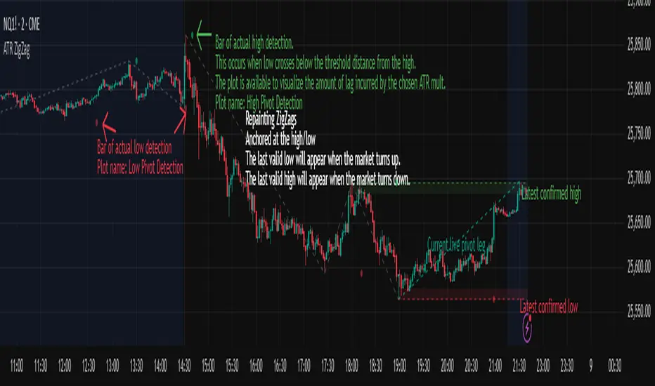
ATR ZigZag - Volatility-Filtered Market StructureDescription
This indicator draws ZigZags using an ATR based threshold for direction switching to identify major swing highs and lows. Instead of relying on fractals or fixed bar-count swings, pivots are confirmed only when price moves beyond the prior extreme by:
threshold = ATR(length) × ATR_mult
This filters noise, enforces valid swing structure (high → low → high), and adapts automatically to volatility. The ATR ZigZag is ideal for traders who want a clean, objective view of swing structure without noise. This has many uses, including mapping swing structure, drawing chart patterns, and trading around extremes.
Lag and Repainting
Pivots are confirmed only after price moves sufficiently in the opposite direction. This creates necessary lag. The ZigZag is drawn when this occurs, and will anchor to the high/low in the past. Optional detection dot plots show exactly when confirmation occurred.
What You See
ZigZag: dashed gray line, repainted to anchor at the confirmed highs and lows
Latest Pivot Levels: Dashed horizontal lines at the most recent confirmed high/low.
Optional Live Swing Leg: A real-time line from the last confirmed pivot to the current swing extreme, updating until a new pivot forms.
Optional ATR Boxes: 1×ATR shaded zones around the latest pivot for structural context.
Optional Pivot Confirmation Dots: Markers show the bar where the threshold is crossed and a swing is officially confirmed. This is to understand the lag and see when the ZigZag repainted.
Liquidations (TV Source / Manual / Proxy) Cruz Pro Stack + Liquidations (TV Source / Manual / Proxy) is a high-confluence crypto trading indicator built to merge reversal detection, volatility timing, structure confirmation, and liquidation pressure into one clean decision engine.
This script combines five pro-grade components:
1) RSI Divergence (Regular + Hidden)
Detects early momentum shifts at tops and bottoms to anticipate reversals before price fully reacts.
2) BBWP (Bollinger Band Width Percentile)
Identifies volatility compression and expansion cycles to time breakout conditions and avoid low-quality chop.
3) Market Structure (BOS / CHOCH proxy)
Confirms trend continuation or change-of-character using swing breaks for more reliable directional bias.
4) Liquidations Layer (3 Modes)
Adds liquidation-driven context for where price is likely to squeeze or flush next:
TV Source: Use TradingView’s built-in Liquidations plot when available.
Manual Totals: Paste 12h/24h/48h long/short totals for higher-level regime bias.
Proxy (Volume Shock): A fallback approximation for spot charts using volume + candle direction.
The script automatically converts your chart timeframe into rolling 12/24/48-hour windows, then computes a weighted liquidation bias and a spike detector to flag potential exhaustion moves.
5) Confluence Score + Signals
A simple scoring engine highlights high-probability setups when multiple factors align.
Signals are printed only when divergence + structure + volatility context agree with liquidation pressure.
How to use
Best on BTC/ETH perps across 15m–4H.
For maximum accuracy:
Add TradingView’s Liquidations indicator (if your exchange/symbol supports it).
Set Liquidations Mode = TV Source.
Select the Liquidations plot as the source.
If that plot can’t be selected, switch to Proxy or Manual Totals.
What this indicator is designed to improve
Earlier reversal recognition
Cleaner breakout timing
Structure-confirmed entries
Better risk management around liquidation-driven moves
Fewer low-quality trades during dead volatility

Liquidation Heatmap [Alpha Extract]A sophisticated liquidity zone visualization system that identifies and maps potential liquidation levels based on swing point analysis with volume-weighted intensity measurement and gradient heatmap coloring. Utilizing pivot-based pocket detection and ATR-scaled zone heights, this indicator delivers institutional-grade liquidity mapping with dynamic color intensity reflecting relative liquidity concentration. The system's dual-swing detection architecture combined with configurable weight metrics creates comprehensive liquidation level identification suitable for strategic position planning and market structure analysis.
🔶 Advanced Pivot-Based Pocket Detection
Implements dual swing width analysis to identify potential liquidation zones at pivot highs and lows with configurable lookback periods for comprehensive level coverage. The system detects primary swing points using main pivot width and optional secondary swing detection for increased pocket density, creating layered liquidity maps that capture both major and minor liquidation levels across extended price history.
🔶 Multi-Metric Weight Calculation Engine
Features flexible weight source selection including Volume, Range (high-low spread), and Volume × Range composite metrics for liquidity intensity measurement. The system calculates pocket weights based on market activity at pivot formation, enabling traders to identify which liquidation levels represent higher concentration of potential stops and liquidations with configurable minimum weight thresholds for noise filtering.
🔶 ATR-Based Zone Height Framework
Utilizes Average True Range calculations with percentage-based multipliers to determine pocket vertical dimensions that adapt to market volatility conditions. The system creates ATR-scaled bands above swing highs for short liquidation zones and below swing lows for long liquidation zones, ensuring zone heights remain proportional to current market volatility for accurate level representation.
🔶 Dynamic Gradient Heatmap Visualization
Implements sophisticated color gradient system that maps pocket weights to intensity scales, creating intuitive visual representation of relative liquidity concentration. The system applies power-law transformation with configurable contrast adjustment to enhance differentiation between weak and strong liquidity pockets, using cyan-to-blue gradients for long liquidations and yellow-to-orange for short liquidations.
🔶 Intelligent Pocket State Management
Features advanced pocket tracking system that monitors price interaction with liquidation zones and updates pocket states dynamically. The system detects when price trades through pocket midpoints, marking them as "hit" with optional preservation or removal, and manages pocket extension for untouched levels with configurable forward projection to maintain visibility of approaching liquidity zones.
🔶 Real-Time Liquidity Scale Display
Provides gradient legend showing min-max range of pocket weights with 24-segment color bar for instant liquidity intensity reference. The system positions the scale at chart edge with volume-formatted labels, enabling traders to quickly assess relative strength of visible liquidation pockets without numerical clutter on the main chart area.
🔶 Touched Pocket Border System
Implements visual confirmation of executed liquidations through border highlighting when price trades through pocket zones. The system applies configurable transparency to touched pocket borders with inverted slider logic (lower values fade borders, higher values emphasize them), providing clear historical record of liquidated levels while maintaining focus on active untouched pockets.
🔶 Dual-Swing Density Enhancement
Features optional secondary swing width parameter that creates additional pocket layer with tighter pivot detection for increased liquidation level density. The system runs parallel pivot detection at both primary and secondary swing widths, populating chart with comprehensive liquidity mapping that captures both major swing liquidations and intermediate level clusters.
🔶 Adaptive Pocket Extension Framework
Utilizes intelligent time-based extension that projects untouched pockets forward by configurable bar count, maintaining visibility as price approaches potential liquidation zones. The system freezes touched pocket right edges at hit timestamps while extending active pockets dynamically, creating clear distinction between historical liquidations and forward-projected active levels.
🔶 Weight-Based Label Integration
Provides floating labels on untouched pockets displaying volume-formatted weight values with dynamic positioning that follows pocket extension. The system automatically manages label lifecycle, creating labels for new pockets, updating positions as pockets extend, and removing labels when pockets are touched, ensuring clean chart presentation with relevant liquidity information.
🔶 Performance Optimization Framework
Implements efficient array management with automatic clean-up of old pockets beyond lookback period and optimized box/label deletion to maintain smooth performance. The system includes configurable maximum object counts (500 boxes, 50 labels, 100 lines) with intelligent removal of oldest elements when limits are approached, ensuring consistent operation across extended timeframes.
This indicator delivers sophisticated liquidity zone analysis through pivot-based detection and volume-weighted intensity measurement with intuitive heatmap visualization. Unlike simple support/resistance indicators, the Liquidation Heatmap combines swing point identification with market activity metrics to identify where concentrated liquidations are likely to occur, while the gradient color system instantly communicates relative liquidity strength. The system's dual-swing architecture, configurable weight metrics, ATR-adaptive zone heights, and intelligent state management make it essential for traders seeking strategic position planning around institutional liquidity levels across cryptocurrency, forex, and futures markets. The visual heatmap approach enables instant identification of high-probability reversal zones where cascading liquidations may trigger significant price reactions.

Crypto Anchored VWAP (Swing High/Low)Crypto Anchored VWAP (Swing High/Low)
This indicator provides an automatic Anchored VWAP system designed specifically for highly volatile assets such as cryptocurrencies (ETH, BTC, SOL, etc.).
Unlike traditional AVWAP tools that require manual date input, this script automatically anchors VWAP to the most recent swing high and swing low, making it ideal for real-time trend tracking and intraday/4H structure analysis.
How It Works
The script detects local swing lows and swing highs based on user-defined swing length.
When a new swing point appears, an Anchored VWAP is initialized from that specific candle.
As price evolves, the AVWAP dynamically becomes:
A trend boundary
A fair-value line
A mean-reversion attractor
Traders can use these levels to identify:
Trend continuation
Breakout confirmation
Mean reversion pullbacks
Overextended expansions
Included Features
✔ Auto-Anchored VWAP from swing low
✔ Auto-Anchored VWAP from swing high
✔ Standard deviation bands (1σ) for volatility context
✔ Designed for Crypto 4H / 1H / 15m
✔ Works on any asset & any timeframe
How To Use
1. Trend Direction
Price above Swing-Low VWAP → Bullish bias
Price below Swing-High VWAP → Bearish bias
2. Trade Setups
Break → Retest → Hold above AVWAP = Trend continuation long
Reject from AVWAP / σ band = Mean-reversion short setup
AVWAP zone → High probability liquidity reaction
3. Volatility Bands
Price touching +1σ = extension
Price returning to 0σ = mean reversion
Price breaking −1σ = trend weakening
Inputs
Swing Length: determines sensitivity of swing high/low detection
(Default: 5)
Best Use Cases
ETH 4H trend following
BTC structure shifts
Altcoin volatility filtering
Identifying institutional "cost basis" zones
Confirming breakouts / fakeouts
Notes
This is not a trading system by itself but a structural tool meant to help traders understand trend and value location. Always combine AVWAP with market structure, volume, and risk management.
Disclaimer
This script is for educational and informational purposes only. It does not constitute financial advice or a recommendation to buy or sell any asset. Use at your own discretion.

Key Levels v1Key Levels
This comprehensive multi-timeframe indicator provides traders with key price levels and opening ranges across multiple timeframes, designed to identify significant support/resistance zones and market structure.
KEY FEATURES:
📦 Monthly Range Box
- Automatically draws a box capturing the high and low of the first 9 hours of each new month
- Box extends until the next month begins
- Includes an optional mid-line showing the 50% level of the range
- Fully customizable colors, line styles, and background opacity
📊 Multi-Timeframe Open Lines
The indicator plots horizontal lines at the open price of:
- Midnight Open (00:00 session start)
- 4-Hour Open (updates every 4-hour candle)
- Daily Open (true daily candle open)
- Weekly Open (start of trading week)
- Monthly Open (start of new month)
- Yearly Open (start of new year)
🎯 Smart Label System
- Automatic label combining when multiple timeframe opens overlap at the same price
- Clean text labels positioned ahead of current price to avoid obstruction
- Labels show combined timeframes (e.g., "Monthly Open / Weekly Open")
⚙️ Customization Options
Each timeframe open line includes:
- Toggle on/off independently
- Custom color selection
- Line style options (Solid, Dashed, Dotted)
- Organized settings grouped by timeframe for easy navigation
🔧 Technical Implementation
- Uses request.security() for accurate higher timeframe data
- Works on any chart timeframe
- Lines extend 10 bars beyond current price for clear label visibility
- Efficient overlap detection prevents duplicate labels
IDEAL FOR:
✓ Identifying key institutional levels
✓ Trading range breakouts
✓ Multi-timeframe analysis
✓ Support and resistance zones
✓ Session-based trading strategies
All settings are organized chronologically from shortest to longest timeframe for intuitive configuration.

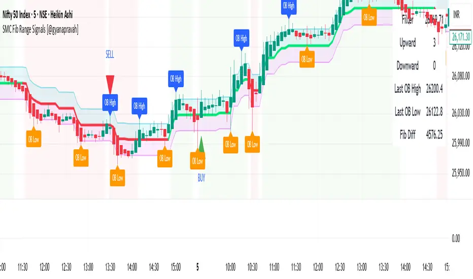
SMC Fib Range Signals [@gyanapravah]SMC Fib Range Signals
This indicator blends Smart Money Concepts (SMC) with a Range Filter Trend System and Fibonacci Retracement & Extensions to generate high-probability automated Buy/Sell signals.
Designed to avoid noise and focus on market structure + trend + price confluence, this tool is ideal for:
1. Intraday traders
2. Swing traders
3. Index & stock traders
4. Crypto & Forex traders
CORE FEATURES
Range Filter Trend Detection
Smooth adaptive filter identifies true trend direction
Visual confirmation:
🟢 Green filter = bullish pressure
🔴 Red filter = bearish pressure
🟡 Yellow filter = neutral
Upper & Lower Bands act as dynamic support/resistance zones
Smart Money Order Blocks (SMC)
Automatically detects important pivot highs & lows
Marks:
OB High → supply / resistance zone
OB Low → demand / support zone
Continuously tracks latest OB levels for live price interaction
Fibonacci Engine
Detects the current swing zone and plots:
Retracement levels
0.236 – 0.382 – 0.500 – 0.618 – 0.786 (editable)
Extension targets
1.272 – 1.618
All levels update dynamically on new market structure and pivots.
SIGNAL ENGINE
This indicator generates signals from three independent confirmation systems:
BUY SIGNALS trigger when:
1. Trend flips bullish (price crosses above the Filter)
2.Bullish trend + price reacts near:
Order Block support
Fibonacci 0.382 / 0.618 levels
Bounce from the Lower Band with trend support
All setups require volume confirmation to filter fake breakouts.
SELL SIGNALS trigger when:
1. Trend flips bearish (price crosses below the Filter)
2. Bearish trend + price reacts near:
Order Block resistance
Fibonacci 0.382 / 0.618 levels
Rejection from the Upper Band with trend support
ALERTS READY
Two built-in alerts:
BUY Alert — fires on bullish signal
SELL Alert — fires on bearish signal
INPUT SETTINGS
Trend Engine
1.Source
2.Sampling Period
3.Range Multiplier
Smart Money
Pivot detection sensitivity (Left / Right bars)
Fibonacci
1.Swing lookback length
2.Editable Fib retracement and extension values
3.Toggle show/hide Fib levels
BEST USE CASE
Works extremely well on:
⏱️ 3M – 15M Intraday scalping
⏱️ 30M – 1H positional entries
⏱️ 4H – D1 swing trading
Tested on:
NIFTY / BANKNIFTY / FINNIFTY
Stocks
Crypto
Forex
DISCLAIMER
This indicator is for educational purposes only.
It does NOT guarantee profits.
Always use:
Proper risk management
Stop-loss rules
Your own confirmation before entering trades.
AUTHOR
Built & shared by @gyanapravah (Odisha, India)
Open-source for learning and community improvement.